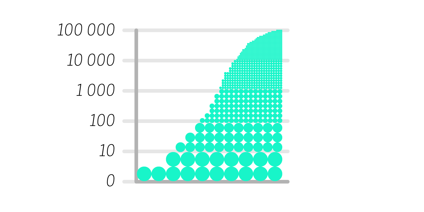
To help the lack of natural human skills to understand exponentials it seems relevant to find new ways to visually represent them in a humanly intuitive way.

为了帮助缺乏自然的人类技能来理解指数,寻找新的方式以人类直观的方式直观地表示它们似乎很重要。
Nowadays, Infographists develop amazingly creative ways to make abstract data understandable to everyone, but they are mostly individual solutions per each case.
如今,Infographists开发了令人惊讶的创造性方法,使每个人都可以理解抽象数据,但是对于每种情况,它们大多是单独的解决方案。
It seems necessary to find a visual system relevant for exponentials, accurate and simple enough to be easily implemented and understood.
似乎有必要找到一种与指数相关的视觉系统,其准确度和简单度应易于实现和理解。
As a Graphic Designer myself, I approached this issue and come up with some early concepts that can help better understand exponentials.
作为一名平面设计师,我亲自解决了这个问题,并提出了一些早期概念,可以帮助更好地理解指数。
While there are out there some examples of exponential visualizations showing its progress as an animation or video –the same way Powers of Ten does or like this example of computing exponential growth– I consider that motion generates more complexity in terms of creation and readability, and we miss the simplicity of a single visual impact. So, while I don’t discard a dynamic solution, I prioritize a static image system.
尽管有一些指数化可视化的示例,以动画或视频的形式展示了它的进展-就像《十方 幂 》所做的一样,还是像这个计算指数级增长的示例一样-我认为运动在创建和可读性方面会产生更多的复杂性,并且我们错过了单一视觉冲击的简单性。 因此,尽管我不放弃动态解决方案,但仍将静态图像系统作为优先级。
Logarithmic graphs visually remind me of a landscape perspective, where closer objects look bigger and further objects look smaller.
对数图在视觉上让我想起了景观角度,附近的物体看起来更大而其他物体看起来更小。

But in logarithmic graphs there’s a disruptively wrong element that kills the perspective, the line. Imagine the line as a path. If we scale the thickness of the line proportionally to the change of scale it matches our ‘perspective language’ and it makes it more comprehensive.
但是在对数图中,存在破坏性的错误元素,这扼杀了透视线。 想象这条线是一条路径。 如果我们根据比例尺的变化成比例地缩放线的粗细,则它与我们的“透视语言”相匹配,并且使其更加全面。

Different visual codes would even make it more equal in terms of data details inside the same chart; for example using escalated circles.
不同的视觉代码甚至可以使同一图表内的数据细节更加平等; 例如使用升级的圈子。

As mentioned before, despite the impression of a curve to the infinite, exponentials have limits and representing this reality (as far as possible) would help understand where is this curve going.
如前所述,尽管给人以无限曲线的印象,但指数是有极限的,并且(尽可能)表示这一现实将有助于理解该曲线的去向。

While a context reference is sometimes used in a graph explanation or in the graph itself, the suggestion is to close down the graph itself where the trajectory seems to continue to infinite.
虽然有时在图形说明中或图形本身中使用上下文引用,但建议是在轨迹似乎继续无限的地方关闭图形本身。
以上就是本篇文章【百度指数可视化_可视化指数】的全部内容了,欢迎阅览 ! 文章地址:http://dfvalve.xrbh.cn/news/9232.html 资讯 企业新闻 行情 企业黄页 同类资讯 首页 网站地图 返回首页 迅博思语资讯移动站 http://keant.xrbh.cn/ , 查看更多 点击拨打:
点击拨打: